// 05_DESIGN_MEDIA AESTHETIC · DELIBERATE

Engineer who designs.
Designer who engineers.

Brand systems, client communications, interface engineering, presentation design. I think in pixels and tokens, breakpoints and gradients, the relationship between letterforms and the products they live inside. This page itself is the strongest evidence.

// BRAND_PALETTE
// PHILOSOPHY

Design is the part you can't compile.

Engineers solve problems. Designers solve perception. The best work happens when the same person can do both — because most production problems are perception problems, and most perception problems are systems problems wearing a different jacket.

My design instinct comes from engineering: every choice has a tradeoff, every system has constraints, and clarity always beats decoration. I'd rather strip ten things off a page than add one. The goal isn't beauty for its own sake — it's beauty that communicates.

// FEATURED_DELIVERABLE

AC4S · Microsoft 365 Advisory

Client communications design under real stakes. Delivering price-increase news without losing client trust.

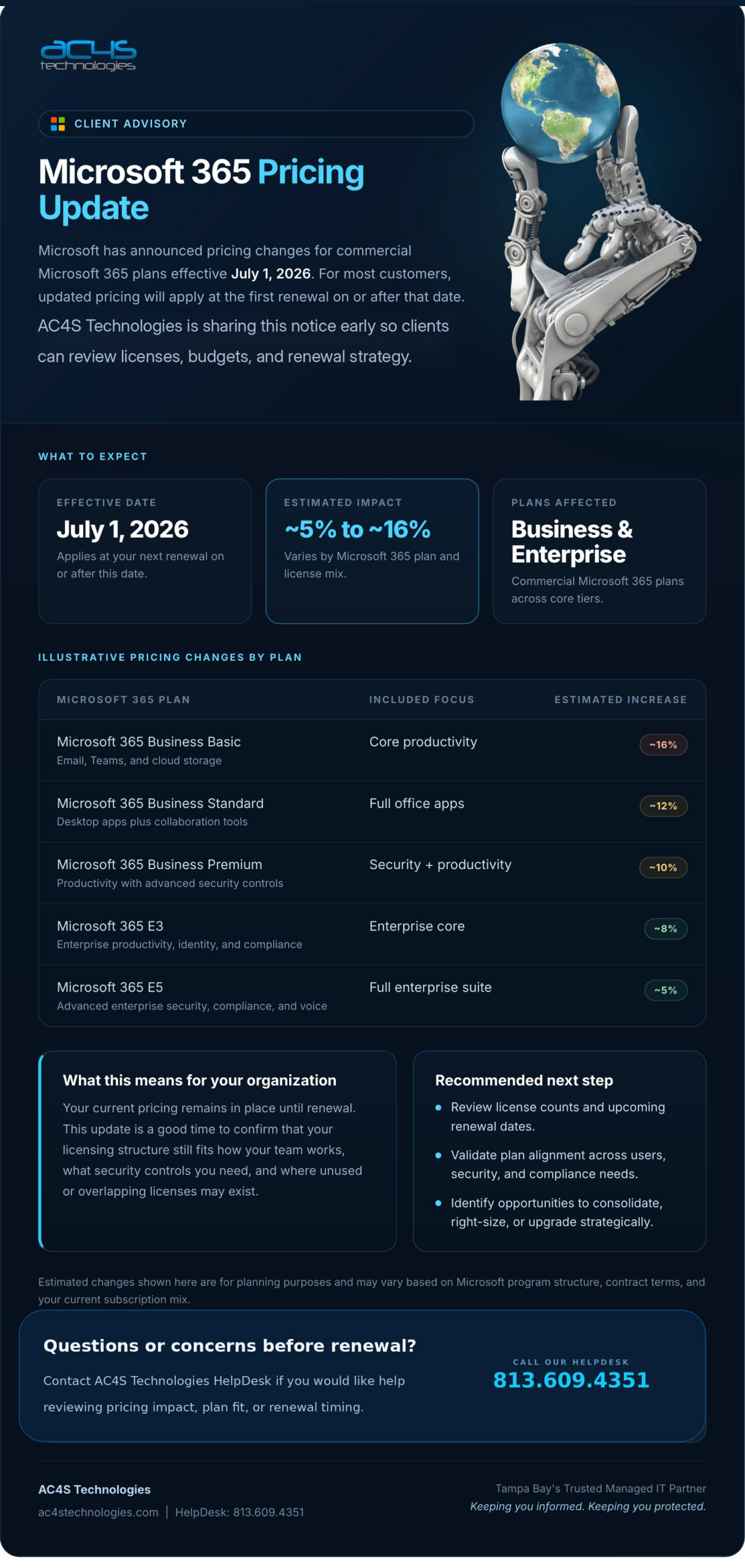
AC4S Technologies Microsoft 365 Pricing Update advisory flyer — dark navy design with cyan accents, structured pricing table, robot hand holding earth
// AWAITING_ASSET

Upload the AC4S M365 flyer to WP Media Library, then replace the src URL in the code.

The brief

Microsoft announced commercial M365 pricing changes effective July 2026, with estimated impacts ranging from ~5% to ~16% across Business and Enterprise tiers. AC4S — Tampa Bay's managed IT partner — needed to inform its client base early so they could review licenses, budgets, and renewal strategy before the changes hit at renewal time.

The challenge wasn't the information. It was the tone. Price-increase news without on-brand polish risks looking like a panic blast. Done right, it builds trust by showing the partner is paying attention.

The design decisions

  • Dark navy + cyan — pulled directly from AC4S's existing brand to feel like a continuation, not a new asset
  • Structured pricing table with color-coded impact pills (red 16%, yellow 12%, green 5%) so readers can scan their tier instantly
  • "What this means" + "Recommended next step" side-by-side panels that translate Microsoft's news into client action
  • HelpDesk phone number elevated as the primary CTA — anxious clients call, they don't read
  • Robot-hand-earth hero image for warmth and a slight surreal note, balancing the technical content

The outcome

Distributed as both a print-ready PDF and digital announcement. Clients received it ahead of renewal cycles with enough lead time to evaluate. The piece reads as "informed partner getting ahead of an industry change" — exactly the position AC4S needs to occupy.

Figma Brand Systems Print + Digital Client Comms
// BRAND_SYSTEMS

Designing the container, not just the contents.

A brand isn't a logo. It's the system that makes every artifact feel inevitable.

VEEMISHRA.COM

veemishra.com

The site you're reading. Five-color palette, dual-font hierarchy (Poppins + JetBrains Mono), three distinct visual languages across discipline pages (tactical for cyber, console for engineering, editorial for design). Custom CSS, no theme — every gradient, animation, and component is hand-built.

CSS Brand System Motion Typography
KARE · 11 BRANDS

KARE PharmTech ecosystem

11+ sub-brands under one parent identity. Built the corporate site to communicate ecosystem hierarchy without flattening any individual brand. The challenge: each sub-brand needs its own visual handle, but the system overall needs to read as one company. Solved through divider repetition, consistent logo grid scale, and shared gradient language.

Multi-brand Visual hierarchy Bootstrap UX
// VISUAL_LANGUAGE

The system on display.

Live elements pulled from the design system this site runs on.

// TYPOGRAPHY
H1 · Display Systems.
H2 · Section Section heading.
H3 · Card Card title.
Body Body copy reads at 16px with 1.65 line-height for comfortable scanning.
Mono JetBrains Mono · 0.7rem · uppercase
// COMPONENT_STATES
Default
Primary
Ghost
Pills
React Active In Progress
// MOTION
Easing cubic-bezier(0.22, 1, 0.36, 1)
Quick 250ms · hover, focus
Standard 350ms · cards, panels
Reveal 600ms · scroll, mount
// PRESENTATION_DESIGN

Slides that don't apologize for being slides.

♥♥♥♥♥ HIGHSCORE 774% ▮▮▮▮
TRANSFERS HELPING TRANSFERS
START SIGN IN

THT · Pixel-art retro deck

FSU final presentation for Transfers Helping Transfers, delivered as a complete pixel-art retro game UI. Player health bars, score counters, menu screens, scene transitions. Every slide treated as a level, not a slide.

The argument: presentations fail because they look like presentations. The audience switches off the moment they recognize the format. A deck that looks like something else — a game, a magazine, a software interface — buys back attention.

+16%Instagram followers
+774%Blog viewership
A-Final grade
// TOOLS

What I reach for.

Real stack. No "expert in Photoshop" claims.

Fg

Figma

Wireframes, component libraries, prototypes. Primary design tool — UX work at KARE, the AC4S advisory, every component before code.

CSS

CSS as a design tool

The portfolio you're on is hand-coded CSS — no theme, no framework. Most of my visual work ships as code, not as a static export.

Ai

Adobe Suite

Illustrator + Photoshop for branding asset work. Vector logos, raster prep for print and digital, batch image processing.

Cv

Canva

Fast-turnaround social graphics for THT and KARE event marketing. The right tool when speed beats fidelity.

// CREATIVE_CHANNEL

Need something that looks intentional?

Brand systems, client communications design, custom-coded interfaces, presentation work. Especially interested in projects where engineering and design have to live in the same head.